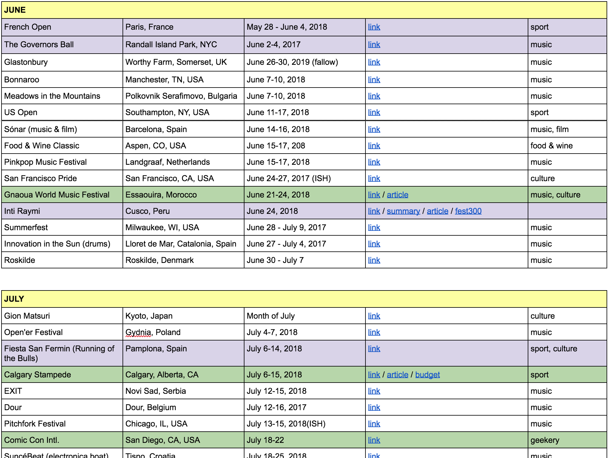
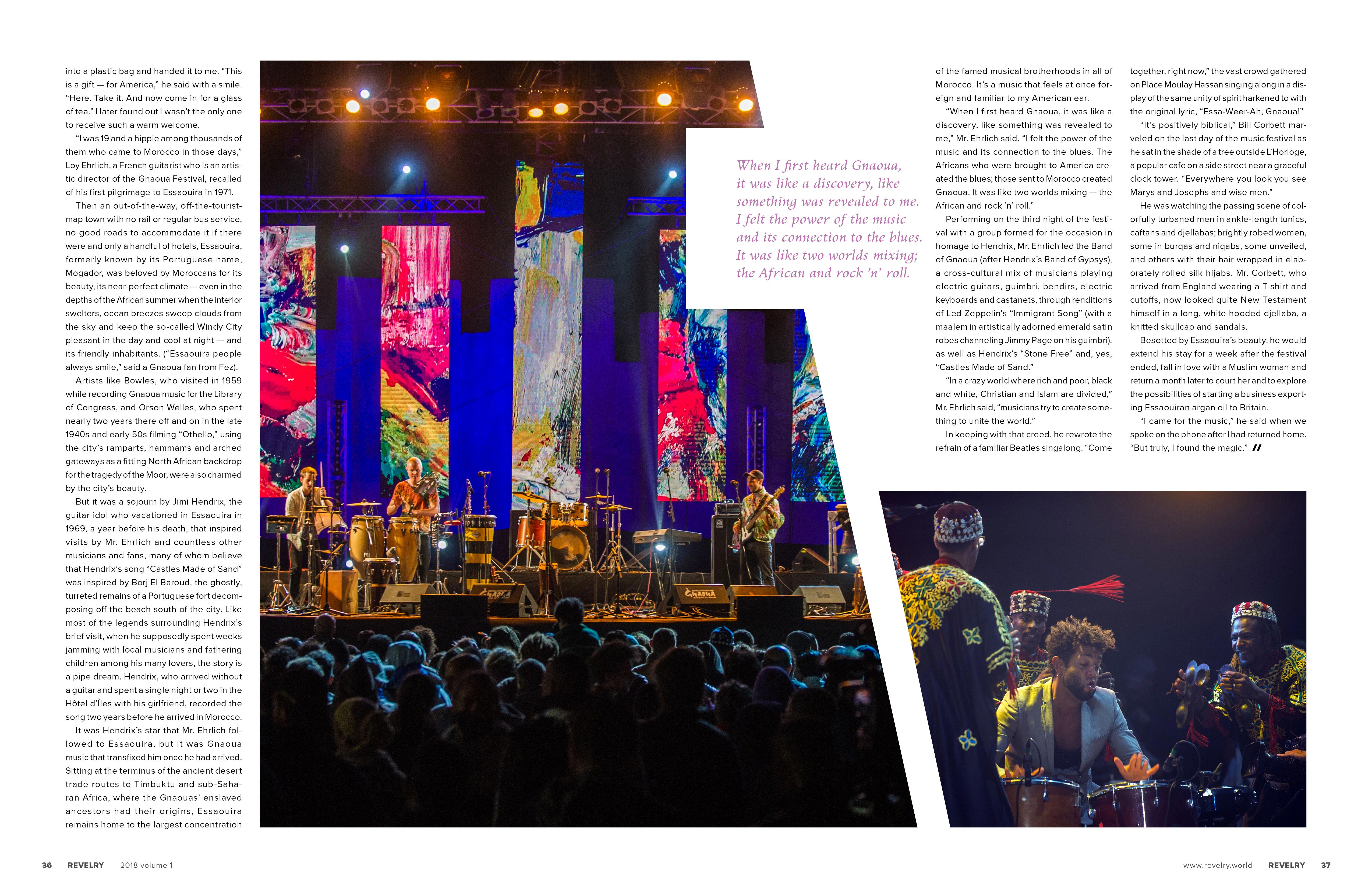
Revelry

Revelry is a quarterly travel magazine that focuses on festivals across the world. We love all of the things that festivals can be, from the global grandeur of the Olympics to the quirky quaintness of your county fair. Whatever speaks to you, somewhere there is a festival out there that celebrates it. Better yet, immerse yourself in something unfamiliar and get caught up in the passion of the revelers around you.

Our readers are aspirational in their desire to be genuinely passionate, earnest, and respectful lovers of multiculturalism and diversity.
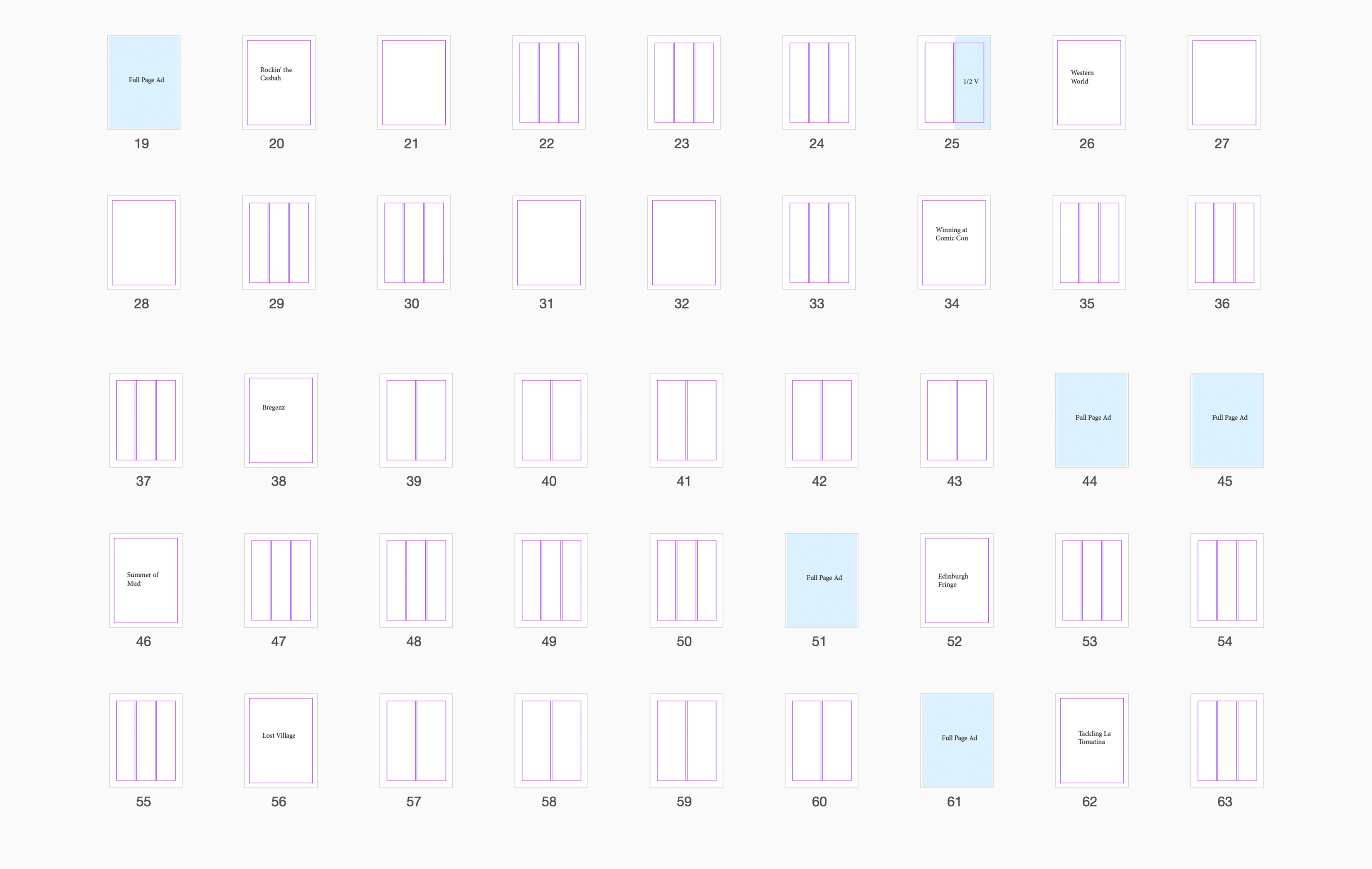
Timeframe: 12 weeks

My Roles: Research, Branding, Copywriting, Image Curation, Print Layout, Advertising

Skills/Tools: Illustrator, InDesign, Photoshop

Project Goals: To study print layout, web design, and branding, I created a magazine about festivals around the world. Donning all of the hats, I became the editor in chief, graphic designer, advertising director, web developer, and the proud owner of four new pennames. The assignment required a minimum of 48 pages, and development of a strong, clear voice supported by your choices of articles, imagery, and layout.

Revelry Revelry Revelry Revelry

Process

After doing a large amount of research into existing travel magazines, collecting survey responses from magazine readers, and creating an extensive calendar of different festivals organized by season, I started looking for existing articles. There weren’t many about festivals, so I recruited a few friends to write for me, and wrote a few more from my own experiences and from reading travel websites and blogs.

Revelry Revelry Revelry Revelry Revelry

Once I knew which festivals I could find or create sufficient content for, I spent time sourcing print-quality images for these festivals. I designed a family of layouts that could be used together as something uniformly recognizable as Revelry, but could also allow for gently modification to suit any particular article. Proxima Nova was used as the main body copy because it has a modern, simple, and direct feeling that I believe pairs well with a wide variety of other fonts, which were selected based on the needs of individual articles.

I used a few appropriate pre-existing ads, but also decided to create my own advertisements for brands that I couldn’t readily find but wanted to include. After receiving positive feedback from my studiomates and instructors, I made minor layout and microtype edits before sending the magazine to be printed.

Revelry Revelry Revelry Revelry Revelry Revelry Revelry Revelry Revelry Revelry Revelry Revelry Revelry Revelry Revelry Revelry Revelry Revelry Revelry Revelry Revelry Revelry Revelry Revelry